

Circle Defender v1.2 Update & Gameplay Video
 OrvilFox
Member Posts: 67
OrvilFox
Member Posts: 67
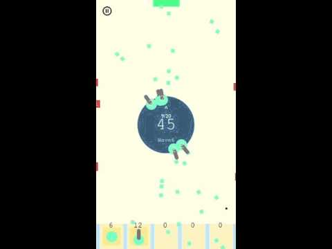
Design
I started from a circle, one of the natural pure form of a shape. Believing that the simplest graphic with interesting gameplay could bring the funnest moments for Quick-Fix type of game.
Dynamic Background
The background directly associate with the Direct Hit from the attackers. Instead of display the number of the Direct Hit HP, the decision to make it visible but not capturing space on the screen is another practice of the design principles.
Ultimate
The new ultimate function makes this game more exciting. You could easily smash all the attackers on the screen with a single tap.
Plus1
By adding the +1 animation after every hit to the attacker, simply to make the game more dynamic to play with.
Performance
Well... For game like this doesn't require any optimizations to make it smooth- Your phone's CPU did the job. But at the most intensive waves, there are over 300 moving actors acting in one scene. Which, still running pretty well.
![]() Leave a comment and let me know what do you think about this game!
Leave a comment and let me know what do you think about this game!
EDIT1: Ops, forgot about the links.
AppStore: https://itunes.apple.com/us/app/circle-defender/id1095176906?ls=1&mt=8
Google Play: https://play.google.com/store/apps/details?id=com.neo1998x.circledefender
Have Fun! ![]()
Comments
looks cool! best of luck with it
✮ FREE templates at GSinvention ✮
✮ Available for hire! support@gsinvention.com ✮
i like the idea.
somehow hypnotic.
some tips
1.) Keep the enemies as slow as they are now but make the player bullets fast in this way the player feels more in control more powerful. Also overall the game will look more dynamic, explosive.
2.) the music beat doesn't fit the speed of the actual gameplay it might if you speed some things up.
3.) the numbers on the objects are barely readable specialy on the canons where they even overlap two different colors.
4.) The particle effects explode and insantly die of that looks broken. I avoid this in my games by shrinking them to 0 over time. also have the two parameters for spawn time and death at the same number to make that work. It will look good.
5.) The bullets should not overlap the UI at the bottom.
6.) The middle big number in the main circle is to close to the one above. It needs a little more space in-between.
My Apps")
https://itunes.apple.com/de/artist/david-zobrist/id733552276
https://play.google.com/store/apps/developer?id=David+Zobrist&hl=de
Thanks for those tips!
Especially agree with No.5. It's kind of stupid that I didn't put them on a separate layer. Must fix in the next update.
Smaller centre circle. Will leave more space for game play. Its begging for a bigger screen. I think a smaller circle would open it up......
Ok played on device. I really like concept. There is a really cool game in there!!! Great ideas.
1)whats the white line down the middle of screen at start? Oh sorry left right.....I get it.
2)Music.......I would change it. Or just kill it.
3) Needs to be speeded up. Sorry my bias. Classic defender is a really fast game.
4)Speed.... the bullets speed up! I wanted to jump on screen and kick them to go faster.
4)A smaller circle would give you more reaction time. A smaller player too would open things up more.....
5)Enemies. Instead of numbers.Example (3) I would have larger blue enemy. Hit is once it turns to smaller yellow enemy. Then smaller green then hit and goes away.
So instead of decreasing numbers you are decreasing in them by size and colour change. I would have to test colour change.......... Maybe just decrease size as its hit.
6)A lot of numbers going on there. Maybe a health bar instead of a number. Hard to follow all the numbers...... You really like numbers....
zhang a neat game there. I like your game. I apologize for being too critical. Keep going!
I have a circle game as well. Mine is missing a lot of your great ideas here. I actually like yours better!!!!
https://geo.itunes.apple.com/us/app/circle/id1016663129?mt=8
I like your colour pallete. I like your simple style.
Nice. Keep up the good work. Overall fun!
Yes maybe the tutorial is a little bit confusing, it was did in purpose to put some letters in the middle line to make it looks..somehow more fit in... It's a shame to born in 90s, missed so much fun
")
lol there is a classic defender?? I never know it (Really!)
Anyway glad you liked it afterall!
Defender
oh wow i never seen a minimap for a sidescroller
My Apps")
https://itunes.apple.com/de/artist/david-zobrist/id733552276
https://play.google.com/store/apps/developer?id=David+Zobrist&hl=de
Looks pretty cool!
@neo1998x looks pretty cool it just needs speed and music that fits in")