Monster Matcher - new release and new branding (by jonmulcahy)
 jonmulcahy
Member, Sous Chef Posts: 10,408
For the past 3.5 years I’ve been releasing games under the company name of “How I Hate The Night”. Now that I have a daughter of my own and a few children’s apps under my belt, I didn’t feel comfortable having a splash screen with the word Hate in it. So, it was time for a rebranding.
I spent some time trying to come up with a name that would suit both the new children’s apps I have created and the existing apps I have out there. I eventually decided on Iceberg Apps.

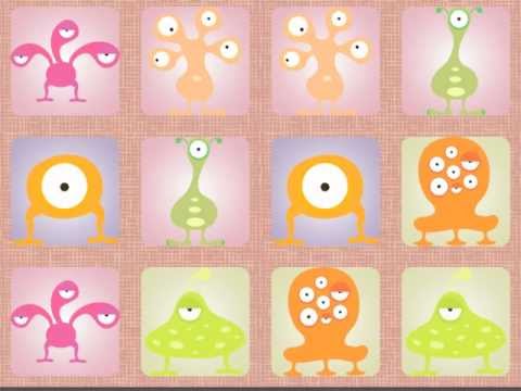
Now, onto my new game release! It's called monster matcher and it's a dynamic matching game. The entire gameplay is in one scenes, with instant level resets / progression. It uses 13 total actors, tables galore and has game center achievements and leaderboards. It should be out the week after next.
Product Website:
http://icebergapps.com/app/monster-matcher/


I spent some time trying to come up with a name that would suit both the new children’s apps I have created and the existing apps I have out there. I eventually decided on Iceberg Apps.

Now, onto my new game release! It's called monster matcher and it's a dynamic matching game. The entire gameplay is in one scenes, with instant level resets / progression. It uses 13 total actors, tables galore and has game center achievements and leaderboards. It should be out the week after next.
Product Website:
http://icebergapps.com/app/monster-matcher/


Comments
really like how owls look in game, but the icon is a meh... maybe a new fun/cute icon? more like cut the rope cute than.. crazy eye hill billie owl.. just my 2 cents.
monsters- i like the characters not so fund of the soft gradient background, and you have same background color for similar color monster, which makes remembering them even harder. maybe make the background all the same color or different monsters each get different color background. also the "desk" where these cards lay on is also not attractive enough. too plumy. really like what you have going on in the first image.. blue/green/turquoise very clean and appealing. blue sky with white cloud... and then things starts to get a bit weird (not in a good way) but weirdness is good because they are monsters...just need to find an appealing weird.
hope that helps and wish you big success with the new/exiting games.
as for the game, looks top notch and a definite upgrade visually from your other "doodle" styled games.
you seem to have reinvented your self
I liked the icon, but that really was just personal preference. At this point no about of work is going to lift that game out of the doldrums. I might make it free for back to school, who knows.
As far as the colors on monsters, I see what you are saying about the background colors, I wanted it to be kinda hard to remember, but I should keep the backgrounds different from the monsters themselves. Those clouds are the four different types of card backings, I didn't want the same backgrounds showing up every time you lay.
I agree that the gameplay background is kinda bland. Kinda by design but also because I couldn't find anything I really loved that didn't distract you from remembering the cards. I'm working on macking the color change every round to give it a little more oomph.
@3xl
Thanks, the original name kinda fell into place a few years ago, I wanted something different when I launched my first game. I agree it is a much better name, and actually describes what I do
I'm hoping this is going to be a good season for apps. I have a lot of ideas but not enough time to do them all
I love the colours on your logo, but personally think the iceberg is too 'thin'. It doesn't, to me anyway, look quite as epic as your games!
Like this maybe - http://www.presentermedia.com/files/clipart/00005000/5248/iceberg_submerged_md_wm.jpg
I'm just talking about the width of the top of the iceberg here.
You shouldn't listen to me though because I loved 'How I Hate the Night' as a company name
Also: I'm no expert!
QS
I feel u man. So many ideas, so little time! Especially u being a dad lol
I finally ported elastik to iPhone/iPod from iPad. So now more ppl can play that game that took me about 6 months to make. time is everything my friend, and I have time now temporally and already submitted 2 apps and working on another one. Gotta take advantage of the time!
I like iceberg apps, and really like your games. Especially A long way home.. I bought it.. And owls looks amazing I'm surprised you said it didnt do well... Where did you get the artwork for this game? I think you mentioned before you bought it somewhere..