Lets Take Over The Universe UI & Art Feedback Needed
 3itg
Member, PRO Posts: 382
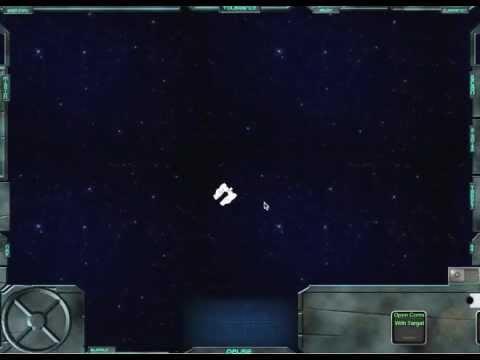
Been working on a UI for Lets Take Over The Universe.
It was a clean, light color UI before.
I decided to go for dark & dirty as it better suits the game.
Feedback is appreciated.

I also just recently finished the Concept art for the members of the party in game, as well as some conversation portraits.

Please let me know what you think.
& like the LTOTU facebook page: https://www.facebook.com/lrn2game
& follow me on twitter @lrn2game
& check out the website: www.ltotu.com
It was a clean, light color UI before.
I decided to go for dark & dirty as it better suits the game.
Feedback is appreciated.

I also just recently finished the Concept art for the members of the party in game, as well as some conversation portraits.

Please let me know what you think.
& like the LTOTU facebook page: https://www.facebook.com/lrn2game
& follow me on twitter @lrn2game
& check out the website: www.ltotu.com


Comments
I can't wait for this game to come out man. My only comment would be for the on-screen controls where when you're tapping on the directional pad and the images of each actor change, the arrows might be difficult to appreciate given that the finger you'll use to tap it would be covering it essentially. Perhaps a glow effect or a depression effect would be more noticeable? But bravo man, props to everything you've done so far and I'm really excited for what's yet to come for this!
This is powered by Unity, though?
I have been teaching myself C# while I wait for the native code engine
But the video I posted is gameplay of the Gamesalad version.
I agree on the Glow instead of arrows. I was thinking I would make the little Arrows permanent, on just turn a "light" in the arrow on & off.
@uptimistik - Thanks for the feedback!
A friend who uses Gamesalad didn't believe this was done Gamesalad...
Its one of the reasons I left the image on the load screen the way it is for now.
(it is the background to The Official Cross-Platform Controller Template provided by GS, the bullets are also mostly unchanged for now.) I still had to show him the project file before he believed me though.
I would love some more feedback on the UI and character art if anyone has critiques to offer.
Thanks for checking it out!
As for your character art, while they seriously contrast against your 3D textured UI, somehow I sort of get it. It definitely reminds me of Cartoon Network's Adult Swim, and I seriously love it! I'm not sure if that's what you're going for, but I dig it.
In the vid you press some buttons in the bottom left. I'm wondering if they will be too small when at iphone size?
I dont think I am going to though, since I cant seem to come up with a way to modify the UI for the smaller screen and still have the game be playable.
So I completely agree with you about the button size.
The only idea I have had is to remove everything about the UI & move all the data it displays into the pause menu.
@TheGabfather
The characters were drawn when the UI was still a light color.
The contrast was one of the things I was looking for, since the "Shading" on the drawings is just blocky black and the character art wont be textured like the rest of everything.
Its funny that you mention Adult Swim.
Im currently writing the scripts and wondering how damaging a "Mature" rating is to app downloads.
I know I cant say #*&% here... but can I say #*&% there?
anyone have experience distributing a game with adult rating for language & cartoon violence?