

What makes a good menu?
 beefy_clyro
Member Posts: 5,394
beefy_clyro
Member Posts: 5,394
Hello,
So as I begin to wrap up my latest project, I've started working on my menu screens and thought to myself what makes a good menu screen. Its often a part that gets overlooked but after all, its the first impression the user gets of our games!
There are many things that can make a menu good in my opinion, whether theres just a cool perspective, a nice mechanic, something emotional ... Lots")
What I think would be good is to have a thread to inspire, simply contribute by sharing your favourites here. Preferably with a video showing it in action.
Here's a few of mine;
Brutal Legend

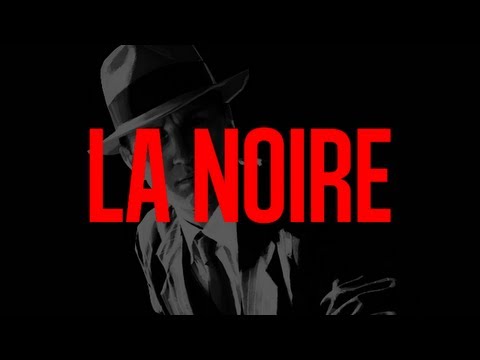
LA Noire
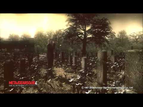
Metal Gear Solid 4
So as I begin to wrap up my latest project, I've started working on my menu screens and thought to myself what makes a good menu screen. Its often a part that gets overlooked but after all, its the first impression the user gets of our games!
There are many things that can make a menu good in my opinion, whether theres just a cool perspective, a nice mechanic, something emotional ... Lots
What I think would be good is to have a thread to inspire, simply contribute by sharing your favourites here. Preferably with a video showing it in action.
Here's a few of mine;
Brutal Legend
LA Noire
Metal Gear Solid 4
Comments
Http://AppStore.com/thetinybangstory
Both have menus that look like they are part of the game world. It creates an immersive experience that makes you feel like your in these strange worlds, not just trying to finish the level.
Contre Jour HD had a very atmospheric menu which involves worlds and had a lot of animation. I love it.
Simple lot of levels I would say simple like angry birds. It's easy for the user.
And that's it haha I like the first one too much.
They often have some animations going on, but not many. Just enough to make the user want to delve in to explore more, because they never give away all of the games secrets and Easter eggs at first glance. This is important, because it helps the scene appear more dynamic and fluid, as well as adding another layer of polish (even if it is simply a pair of eyes that follow the players touch for example) to the overall game.
More often than not, the best games limit the buttons on their initial scenes to; Play, Settings, Other/More Games.
A menu system has to be consistent throughout, with art style representative of the in-game graphics. If you're using bright and colourful buttons, but your game is like Contre Jour, it just won't fit.
Finally, first impressions mean ALOT! This is the best chance you have after your icon, screenshots and description to sell your app, and it's the first thing a reviewer will see.
Make it stand out, make it different and make it awesome!
Therefore, a good menu tends to:
- Be simple
- Be colourful, or at least follow a scheme
- Incorporate some movement or animation
- Feature few buttons
- Be consistant with all other scenes in your game
- Be eye-catching
(Just theory, so no video... Sorry!
iCreationZ
Wing War had a great menu interface for it's time (considering the controller was a flight stick).
Those are kinda like polar opposites. Wing War has seamless integration with the menu/options as it is connects well with the theme and overall atmosphere of the game.
Virtual Fighter as a fighter has less integration between the menu/options and game/controls. It has to rely on bling and pumping that showroom style atmosphere to bring wow factor to the menus. Both carry it out nicely, but when there is too much bling (animations, other things going on) it takes away from the game (not to mention load times to sort through menus/options), besides are you focusing on playing a game or a menu? I'm down with menu and GUIs that push the envelope, as long as they don't push it too far to the point that the effect the game or performance (particularly time issues).
I agree on your points that the menu's although with added polish should not slow the user down to much getting into the game, after all, they are playing the game and not the menu!