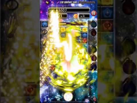
After a few solid weeks, I got a working build that uses the networking features in Gamesalad to make an asynchronous multiplayer mode. I'm running a MAMP server on my personal computer that stores the data and using a separate phone to invite the user in this video.
congratulation! very motivating to see an asynchron mp game working.
That is impressive!
But I don't come around your visual presentation, it is not good. Here a couple of easy fixes/learnings.
Your using to many different text fonts its a design no-go.
The Font on top of your buttons is barely readable.
The background is fighting with the foreground. Make user/player relevant things so the players attention falls upon them, avoid to bright colors and complex structures for the background.
I hope to see more of your multiplayer games or updates for this one in future cool stuff keep it up.
@BigDave said:
congratulation! very motivating to see an asynchron mp game working.
That is impressive!
But I don't come around your visual presentation, it is not good. Here a couple of easy fixes/learnings.
Your using to many different text fonts its a design no-go.
The Font on top of your buttons is barely readable.
The background is fighting with the foreground. Make user/player relevant things so the players attention falls upon them, avoid to bright colors and complex structures for the background.
I hope to see more of your multiplayer games or updates for this one in future cool stuff keep it up.
Wow, thank you for the feedback! I will definitely try to work on those things. Those problems didn't even cross my mind. Haha. I will provide updates on it and I don't mind giving out general questions about it either.
@BigDave said:
congratulation! very motivating to see an asynchron mp game working.
That is impressive!
But I don't come around your visual presentation, it is not good. Here a couple of easy fixes/learnings.
Your using to many different text fonts its a design no-go.
The Font on top of your buttons is barely readable.
The background is fighting with the foreground. Make user/player relevant things so the players attention falls upon them, avoid to bright colors and complex structures for the background.
I hope to see more of your multiplayer games or updates for this one in future cool stuff keep it up.
@chaosmasterro
+1 to what Dave said. Simpler is almost always better. It's often difficult to accurately judge your own work after you've spent so much time looking at it as the creator, so hand it off to a friend and ask "What do you think?" Try to not interrupt or explain anything. Let them experience it all alone.
If they can't read something, get confused or distracted, don't know what to do next or how to do something they want to do, etc., this probably means it's time to rework the visual design.
It's clear that you want this game to be exciting, I can tell just by reading your game title and seeing how you treated the visuals. It might help to remember this in the future: if everything is a priority, nothing is a priority. In this case, that means 'don't try to draw the user's attention to everything'. If the entire screen is screaming for eye-attention, the user will only see noise.
I hope that helps. I didn't give specific feedback, but the general ideas mentioned above can be applied to pretty much everything you'll ever create.
I agree, it's entirely different when someone besides me looks at my work. I think everything is perfect until someone brings up a good point. I already changed a few things in regards to the background. It's a learning experience.
@chaosmasterro
I agree, it's entirely different when someone besides me looks at my work. I think everything is perfect until someone brings up a good point. I already changed a few things in regards to the background. It's a learning experience.
Comments
Thats very cool set up. Nice game too!
congratulation! very motivating to see an asynchron mp game working.
That is impressive!
But I don't come around your visual presentation, it is not good. Here a couple of easy fixes/learnings.
Your using to many different text fonts its a design no-go.
The Font on top of your buttons is barely readable.
The background is fighting with the foreground. Make user/player relevant things so the players attention falls upon them, avoid to bright colors and complex structures for the background.
I hope to see more of your multiplayer games or updates for this one in future cool stuff keep it up.
My Apps
https://itunes.apple.com/de/artist/david-zobrist/id733552276
https://play.google.com/store/apps/developer?id=David+Zobrist&hl=de
Wow, thank you for the feedback! I will definitely try to work on those things. Those problems didn't even cross my mind. Haha. I will provide updates on it and I don't mind giving out general questions about it either.
@chaosmasterro
+1 to what Dave said. Simpler is almost always better. It's often difficult to accurately judge your own work after you've spent so much time looking at it as the creator, so hand it off to a friend and ask "What do you think?" Try to not interrupt or explain anything. Let them experience it all alone.
If they can't read something, get confused or distracted, don't know what to do next or how to do something they want to do, etc., this probably means it's time to rework the visual design.
It's clear that you want this game to be exciting, I can tell just by reading your game title and seeing how you treated the visuals. It might help to remember this in the future: if everything is a priority, nothing is a priority. In this case, that means 'don't try to draw the user's attention to everything'. If the entire screen is screaming for eye-attention, the user will only see noise.
I hope that helps. I didn't give specific feedback, but the general ideas mentioned above can be applied to pretty much everything you'll ever create.
I agree, it's entirely different when someone besides me looks at my work. I think everything is perfect until someone brings up a good point. I already changed a few things in regards to the background. It's a learning experience.
Awesome!