Out of the three options, the first seems like the better choice, as it doesn't distract from the character while not having so much contrast like the third.
The yellow one seems to have too much colours conflicting with each other it makes it look quite messy.
@BigDave said:
Testing around on the background color for the app icon.
Which one?
Hi Dave, not for spam But I created this: https://www.youopinion.com
exactly for this kind of surveys (I used to write emails to my friend to ask what icon would be better for my next game)
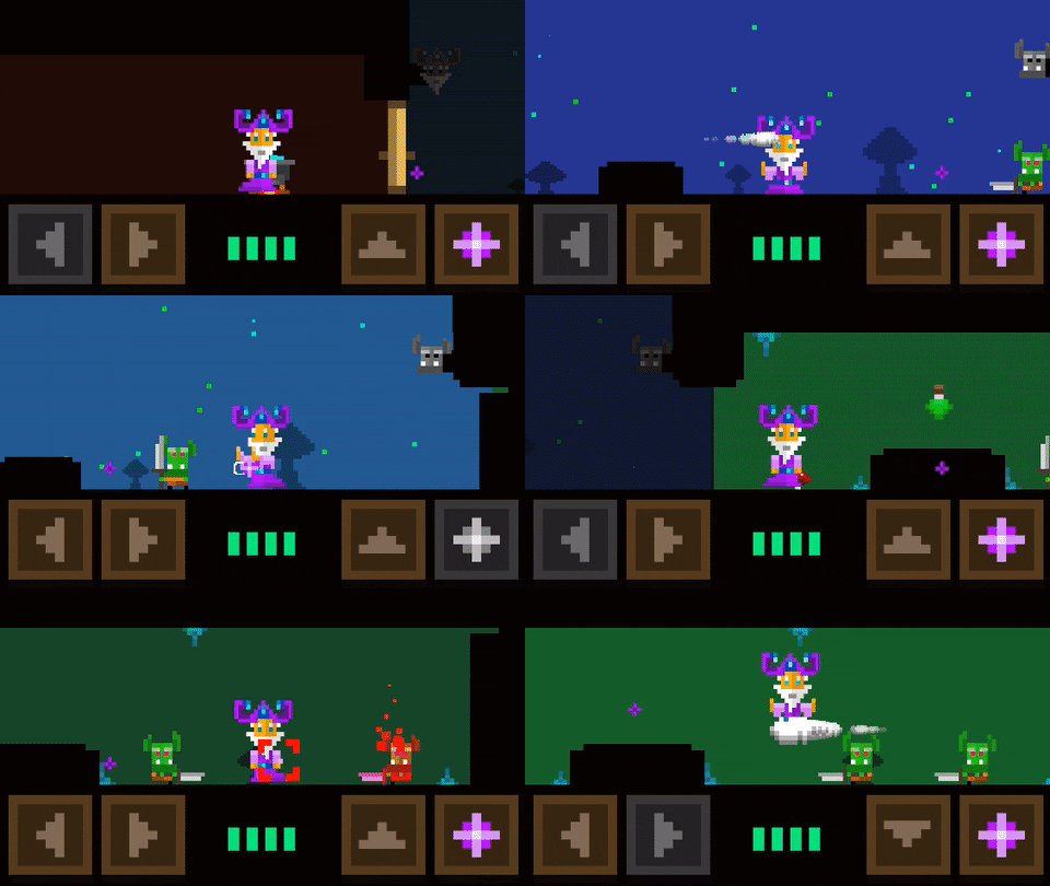
The new goblin enemy archer together with the goblin tank and a just freshly added barrel. Which I am not sure if I use it yet in the final game but it appears to be playful.
I'd definitely keep the barrel, unless you think it could cause problems at some point. It adds potential for some strategic gameplay... or at the least, just lots of silliness as it looks to slide and bounce about quite nicely.
I know that you had the Clicker type games pretty much in the bag, but I do like to see it when you do games like this... looking forward to playing this one when its finished
@Chunkypixels
yep i couldn't do another clicker. Maybe in future or some kind of combination of platform and clickers
But creepy my other platform game does good now. Having the second most daily impressions behind the Orcs cookie clicker.
And creepy was a hell of fun to work on, since I can just give it to people and let them play the new level. They give me feedback, spoken or observed in their behaviour.
btw. I also want to share the first level of this one but the html5 does behave buggy..
It felt so insane funny when it happened!
I did not intend that but I love it and leave it in.
The magic projectile bounce brings things to live in a unexpected way.
I couldn't land the lets call it "skill shot" yet intently. Else it will be more of a lucky shot with a chance i'm not even aware of.
@beefy_clyro
i personally also like the yellow to as it is like a a hot sunny day which I still miss right now..
Also it looks so friendly.
Blue is neutral and got the most votes so far but i am also using the same tone for pug which isn't a real argument as I do not need to have the full color pallet in my portfolio.
It also fuels the ideas about discovering treasures within the barrels.
But I want to keep my thoughts away from an inventory system, focusing on the "Bam bam" action and avoid distractions.
@BigDave It looks great , i noticed something , usually with most platformers i play the jump button is on the right and the hit button is on the left you have it the other way. Even in gameboy platformer games the button on the right jumps and the left button hits. But its not that important its all up to you.
@BigDave said:
Changed the shooting pattern
As it took to long to shoot and didn’t felt good
Now he shoots quicker on tap but reloads after, charging in that energy
Re-scaled some elements as well as giving a speed boost while being on the cloud x2
also found the perfect font
Now I am happy I can start with level 3 once I am back from fuerteventura.
Thanks for following these diary. Always shoot truth if something looks off etc.
I appriciate the input also if I might disagree.
PS: What type of music do you imagine? I have to brief the music guy now and i am not sure yet.
@Hopscotch
i actually agree than i searched an 8 bit version of it. I found a channel doing that.
But the 8 bit version was not so nice. But i checked more songs of this guy and found this.
and
i like both a lot as they remind me to the good old days.
Would be also nice to get a cover like his as app store screenshot.
(painted wizard)
Comments
Out of the three options, the first seems like the better choice, as it doesn't distract from the character while not having so much contrast like the third.
The yellow one seems to have too much colours conflicting with each other it makes it look quite messy.
I see it looks the left one is gonna win the race so far!
Hi Dave, not for spam But I created this:
https://www.youopinion.com
exactly for this kind of surveys (I used to write emails to my friend to ask what icon would be better for my next game)
Under 20 responses the survey is free
@gamevicci nice idea thanks for sharing
The new goblin enemy archer together with the goblin tank and a just freshly added barrel. Which I am not sure if I use it yet in the final game but it appears to be playful.
Looking like a lot of fun...
I'd definitely keep the barrel, unless you think it could cause problems at some point. It adds potential for some strategic gameplay... or at the least, just lots of silliness as it looks to slide and bounce about quite nicely.
I know that you had the Clicker type games pretty much in the bag, but I do like to see it when you do games like this... looking forward to playing this one when its finished
@Chunkypixels
yep i couldn't do another clicker. Maybe in future or some kind of combination of platform and clickers
But creepy my other platform game does good now. Having the second most daily impressions behind the Orcs cookie clicker.
And creepy was a hell of fun to work on, since I can just give it to people and let them play the new level. They give me feedback, spoken or observed in their behaviour.
btw. I also want to share the first level of this one but the html5 does behave buggy..
It felt so insane funny when it happened!
I did not intend that but I love it and leave it in.
The magic projectile bounce brings things to live in a unexpected way.
I couldn't land the lets call it "skill shot" yet intently. Else it will be more of a lucky shot with a chance i'm not even aware of.
Looking great Dave !!! I love the goblin on the barrels
You should have something spill out of the barrel if and when it falls on its side, gold coins or even another (smaller) goblin.
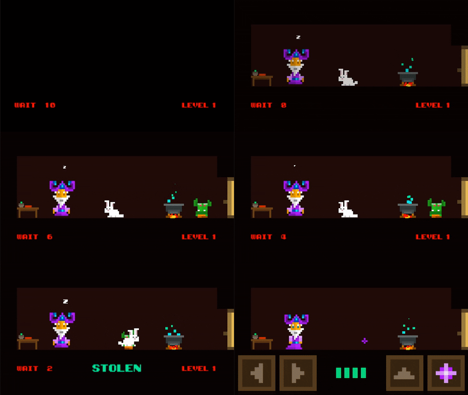
@BigDave Maybe the goblins hid the rabbit in one of the barrels?
Beer.
. . . drinking goblin.
Looking great!
I prefer yellow icon, stands out more! Gets your attention.
When moving, i dont like the fact that he's always looking forward until he shoots. I would like him facing the way he is moving ...
Just my personal preference for what its worth.
@beefy_clyro
i personally also like the yellow to as it is like a a hot sunny day which I still miss right now..
Also it looks so friendly.
Blue is neutral and got the most votes so far but i am also using the same tone for pug which isn't a real argument as I do not need to have the full color pallet in my portfolio.
But i like yellow..
your gold drop idea. I couldn't manage to make proper physical correct beer look good in time without thinking omg what am i doing here.
So its gold. I also think i might just turn this off if any performance issue appear later but for now ok i leave it in.
I also thought about changing the friction and density of the barrel once the gold has been spilled.
Would make sense.
It also fuels the ideas about discovering treasures within the barrels.
But I want to keep my thoughts away from an inventory system, focusing on the "Bam bam" action and avoid distractions.
@BigDave It looks great , i noticed something , usually with most platformers i play the jump button is on the right and the hit button is on the left you have it the other way. Even in gameboy platformer games the button on the right jumps and the left button hits. But its not that important its all up to you.
@Icebox I will look out for it when I give to friends and family to test.
Changed the shooting pattern
As it took to long to shoot and didn’t felt good
Now he shoots quicker on tap but reloads after, charging in that energy
And he has now a proper cloud to ride on

Looking good Dave!!
Love the cloud!
So cool, I love watching the evolution of it!
I really love this.
Re-scaled some elements as well as giving a speed boost while being on the cloud x2
also found the perfect font

Now I am happy I can start with level 3 once I am back from fuerteventura.
Thanks for following these diary. Always shoot truth if something looks off etc.
I appriciate the input also if I might disagree.
PS: What type of music do you imagine? I have to brief the music guy now and i am not sure yet.
Retro style chip tunes... to go with the pixel style graphics
Agree with chunkypixels , retro style chip tunes goes with your style and graphics
Flight of the bumblebee - Rimsky-Korsakov
Play the track and watch the gif ... spot on
Loving all the changes to this one!
@Hopscotch
i actually agree than i searched an 8 bit version of it. I found a channel doing that.
But the 8 bit version was not so nice. But i checked more songs of this guy and found this.
and
i like both a lot as they remind me to the good old days.
Would be also nice to get a cover like his as app store screenshot.
(painted wizard)
Unfortunately, you'd have to get permission from the artist's publishers to use those songs. But they really work well when played against your GIFs.
@Socks
yeah I always either get the permission or use the tracks as reference for getting a similar one done.